This Interactive Map Shows Every Wind Farm In The United States
In celebration of the first-ever American Wind Week, the American Wind Energy Association released an interactive map that shows how the wind power industry has evolved. It can also give basic details for every wind farm that's active.
Updated May 25 2019, 8:09 p.m. ET

Wind power has been rapidly progressing in the United States, and now there’s an interactive map to keep track of it all. The American Wind Energy Association (AWEA) released the new feature on their website this week in celebration of the inaugural American Wind Week from August 6th through August 12th. It gives anyone the ability to pinpoint specific utility-scale projects and wind-related manufacturing facilities all over the country.
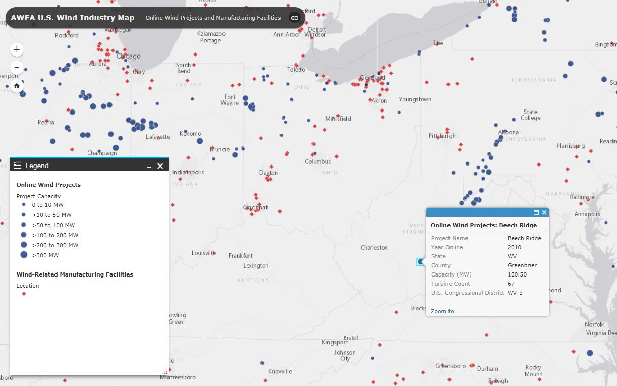
Here's how it works. The map displays the United States spotted with blue and red dots. Blue circles represent wind projects that are currently online. The bigger the dot, the more capacity it has. Their scale goes from projects that have 10 megawatts or less up to anything over 300 megawatts. Most of these circles can be found in the nation’s heartland and in many parts of Texas.
Red diamonds represent wind-related manufacturing facilities. These are production plants that make some impact on the wind power generation industry, such as creating materials, working on the electricity wiring, controlling the energy, and more. While these are just as widely spread around, a lot of facilities are found in the eastern half of the United States -- especially in the Northeast, the Carolinas, and the Great Lakes.
For further information, users can zoom in on the map and select every individual dot. For example, we can take a look at the isolated dot in West Virginia below. This is the Beech Ridge project, and you can find all the basic information on the farm. Here, it notes that 2010 was the year it went online and it’s located in the county of Greenbrier, WV. The capacity is just a shade over 100 megawatts and there are 67 turbines on the farm.
One unique aspect of the map is the “Time Slider” feature. By clicking on the clock below, you can see how the wind power generation industry has grown since 1981. Taking a generic look at the scope, wind farms started going online in California through the 80’s, while Northern Iowa saw some pop up in the early 90’s. By the time we hit past the new millennium, blue dots start rapidly appearing on the map.
John Hensley, the director of data and analysis at AWEA, was thrilled to reveal the new interactive map and hopes it paints a clearer picture for United States citizens on the impact of this industry, stating, "Wind power has become a vital part of the U.S. economy, drawing billions of dollars in capital investment to rural communities each year and supporting over 100,000 U.S. jobs across all 50 states. I'm pleased this new map tool helps Americans visualize how world-class U.S. wind resources are being put to work in all parts of the county."
AWEA’s CEO, Tom Kierman, said in the press release announcing American Wind Week that “an average of 10 more new turbines” are being put up each day. As of now, “there are over 52,000 wind turbines in 41 states” throughout the United States. The new map shows how much the industry has grown in just the past 20 years, and it’s only going to get bigger.